Swiss Modernism was a movement that emphasized communication over the attention grabbing of advertisements. It is fitting then that as the world began to move closer to the modern era and the world began to grow smaller with the development of mass communications that the International Typographic Style would arise.

Note the lack of serifs and the boldness of the type, communication is the key function.
A forerunner of the movement, Amil Ruder a typography instructor of the Basel School of Design taught that legibility and readability are dominant concerns and that type loses its purpose if it loses its communicative meaning.
The fonts in this movement epitomized this ideal. In 1954 Adrian Frutiger completed Univers a font with 21 variations.


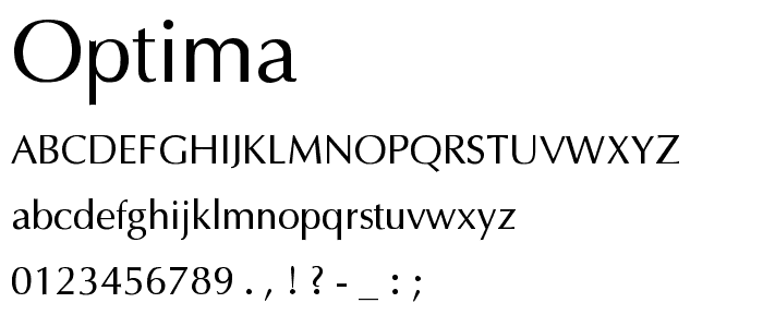
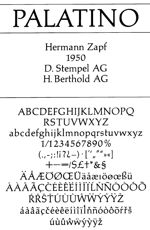
German designer Hermann Zapf would evolve traditions of calligraphy and Renaissance Typography into three typefaces that would also exemplify the movement
Melior

Optima
And Palationo
No comments:
Post a Comment